Trends in design are nothing more than a reaction to cultural and technological changes in the world—the latter influences the audience’s worldview, which is necessary to attract web resources.
You can also read: Must-have tools for Freelancers
Graphic design is a science with its laws, but it has a place for fresh trends. The main thing is to react in time and make changes until they are out of date. It is not too late to identify the trends of web design 2021 to use some of them in their online projects. Some of them have already passed the test of time, while others act as pioneers. However, there is a lot to choose from because the list is quite long.
Table of Contents
Empty Space
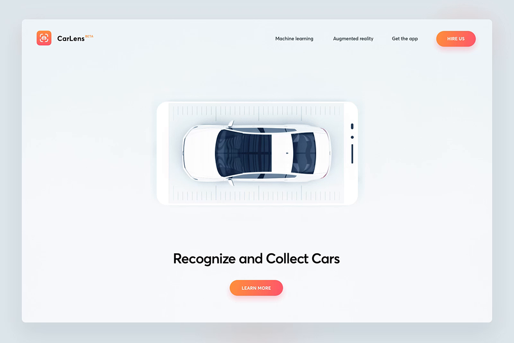
Simplicity continues to fascinate designers, this time manifesting themselves in voluminous voids that are not always where they are expected to be seen. This creates a strong emphasis on the main proposal of the project. In addition, the screen increases visually, especially if it is white spaces. Such, by the way, are most often used to indicate negative space because they harmoniously combined with all shades.
And it is not only a background free of objects but also significant pauses between design components, indentations, interline intervals.
Dark mode
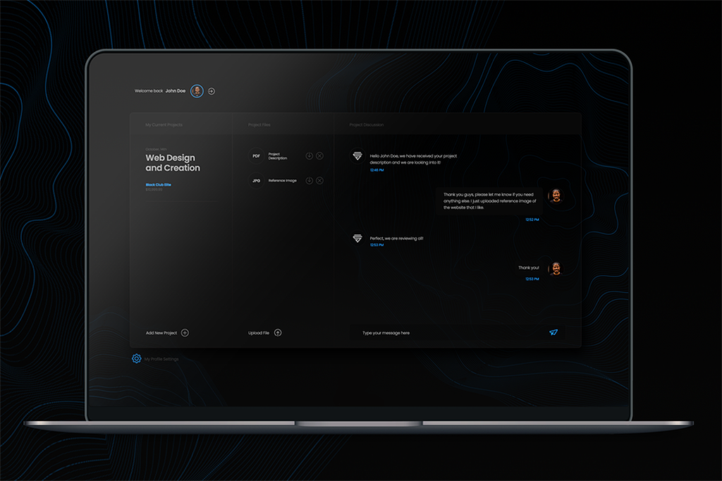
It has been observed that users often turn on a dark background to view meaningful network content, such as the same email. And this year, it has already turned into a real trend.
Having a dark theme is a must-have feature that allows you to give elements of web design visibility due to contrast. In addition, for the eyes viewing in midnight mode – an endless pleasure, not affecting their health. They get tired much less than usual.
And this mode helps to save the charge and prolong the life of the screen, particularly when it comes to OLED displays.
Illustration
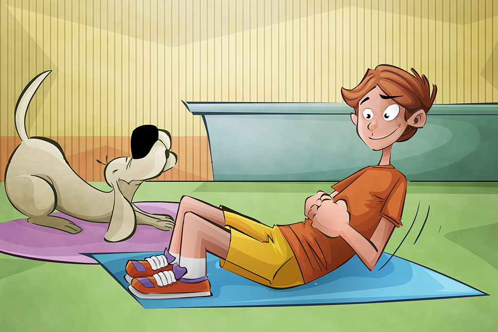
Artistic creativity continues to penetrate the network world. I’d love to. Illustrations in an individual manner are a great way to stand out from the competition. Copying their style is almost impossible, so it is an excellent option for brand self-identification.
Illustrative details give the online platform uniqueness and ease, causing sympathy and trust.
Abstract illustrations with even greater efficiency and identity will be a feature of 2021. However, it is necessary to be careful because graphic abstraction can be interpreted in different ways as a kind of art.
Symbiosis photo with graphics
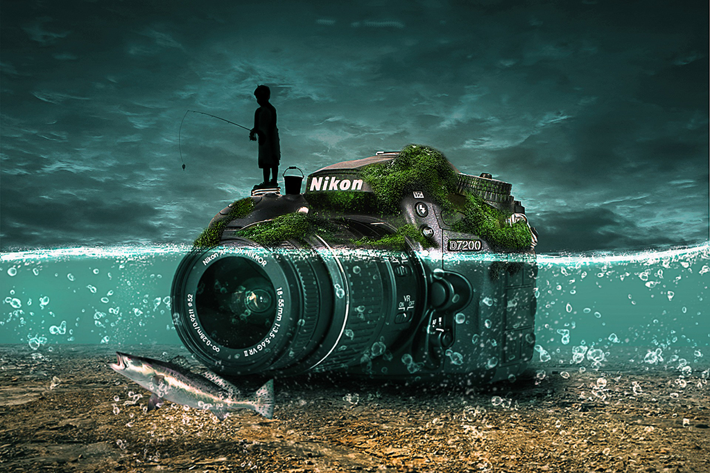
Artistic creativity also penetrated the photos. Overlaying graphics on top of authentic images creates incredibly engaging visual content. The collage effect, created with the help of Photoshop editor, allows you to convey to the consumer a key message much faster and more effectively.
What can we say about the individuality of such photo images! They can beat any product or service in a way that will be remembered for a long time, without unnecessary words and emotions.
Gradients
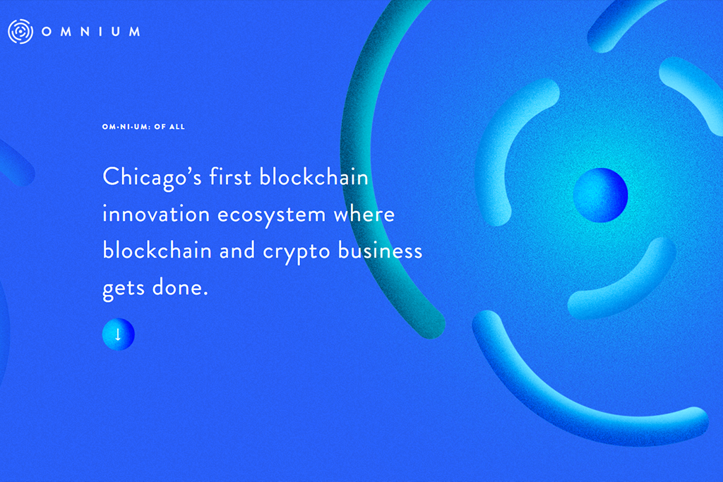
For a short time, web creators survived without this unique color effect, and here it is again on the wave of popularity! But now they are not monotonous and mixed with different colors. This adds depth to objects, making them more attractive and exciting.
A successful gradient is appropriate everywhere – from call-to-action buttons to background. It’s a versatile tool that looks equally good on both large and small displays. The only rule is not to combine too contradictory tones and remember their division into cold and warm.
Color duplex
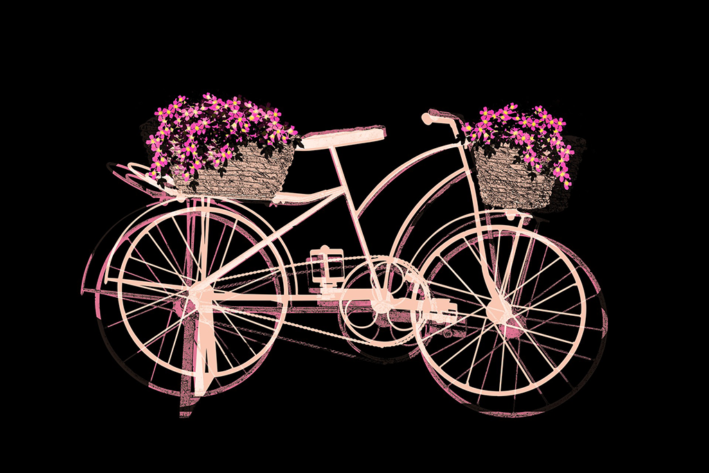
Another coloristic technique that has filled the world wide web is constructed with only two colors. It is already actively used in the case, especially where rebranding is required. And all because this technique helps to transform the web resource, preserving its structure and concept.
Such web-design themes are found on the network everywhere, which shows their success and relevance.
Video
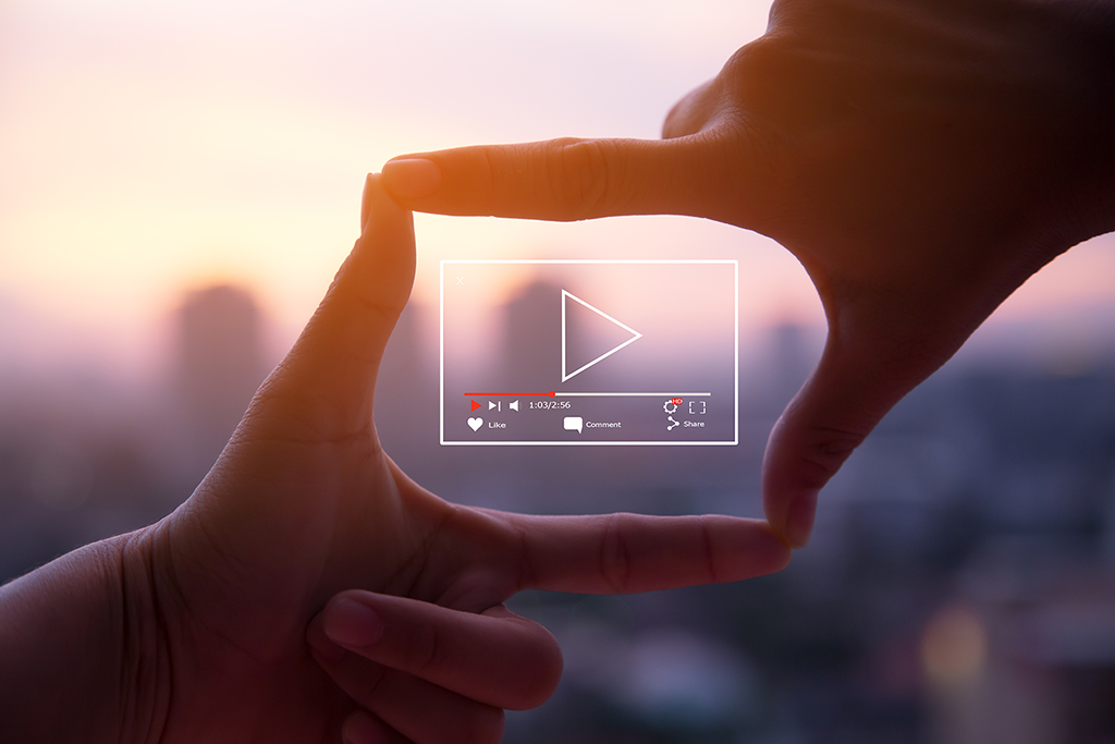
Most people are visual beings, so they want to see what is described after reading the text. And static images alone are not enough for them. Video content continues to fill the media market and is already capturing web design 2021.
Even a small video can convey more information than all selling text on landing. Users like video blocks because they make the experience more lively and dynamic. And to seriously capture their attention, it is recommended to dilute the design of web page rollers with blurred boundaries of beginning and end. To make video helpful content, make sure it:
- It lasts no longer than 5 minutes
- It corresponds to the theme of the page.
- Contains clear information without water.
3D objects
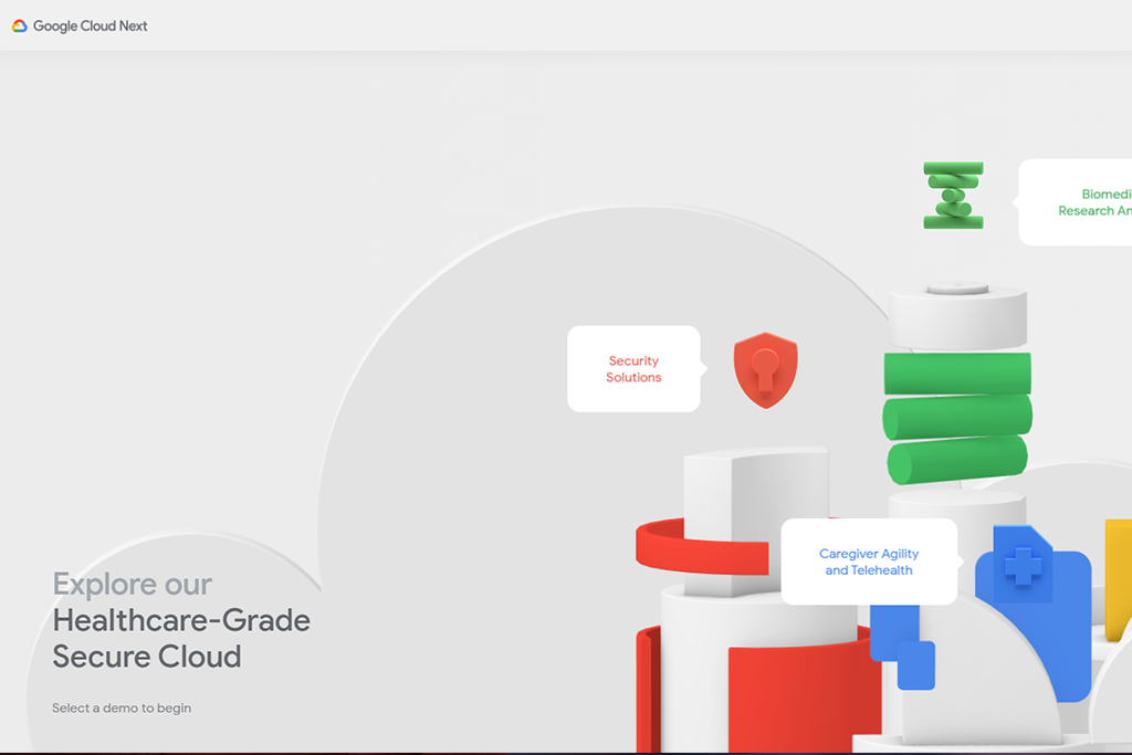
3D technology could not stay imprisoned in gaming and entertainment applications for long. With the increasing power of gadgets, it slowly moves to conventional platforms, thereby adding to the interfaces of realism.
On any selling portal, 3D objects will look original and bright. They are attractive and impressive, creating a WOW effect. In addition, extend the client’s stay on the page.
Giantomania
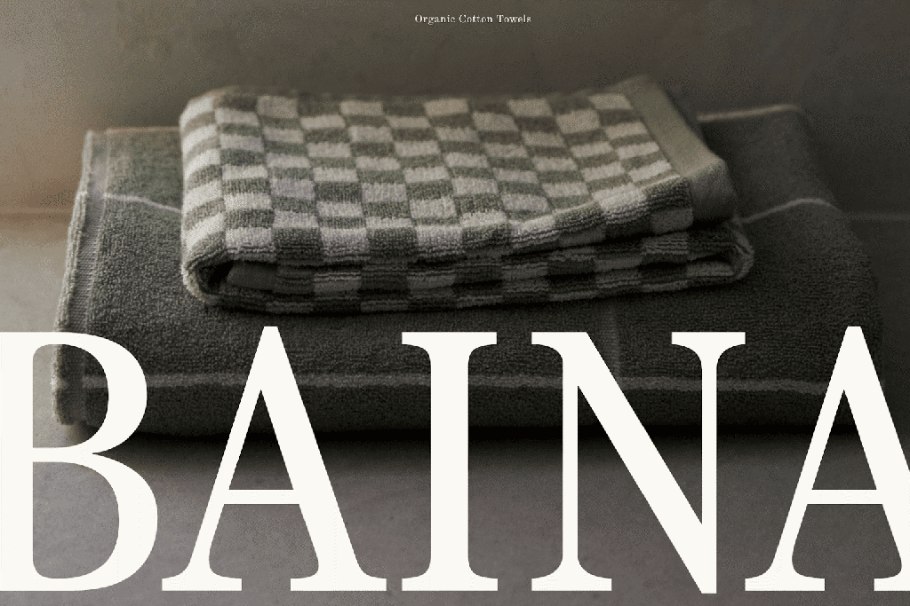
In the pursuit of minimalism, the sites gradually disappear all unnecessary and distracting elements, leaving room only for essential details. The latter grow significantly in size. Maxi-typography is a new trend that is actively manifested in the Internet space.
In addition to the images, the fonts used to create the titles are also enlarged. They help make a powerful statement. For the best effect, additionally used oily mark. And don’t be afraid to overdo it! But these web-design principles only work for:
- Short headlines and phrases
- Simple fonts
- Neutral background.
Retro style

Nostalgia in one form or another is present in many areas. And web-design graphics are no exception. The media, periodically “nostalgic” for the past times, have a considerable influence.
Thus, the centenary of the founding of the Bauhaus School, whose artistic principles had a significant impact on typography and design in general, has pushed many brands to create remakes of its style. A lot of graphic material appeared on the network a la Bauhaus.
However, retro images are not exploited by designers in their purest form but are mixed with modern styles. It turns out a spectacular tandem, impressive high-tech, and some unique charm.
Black and white
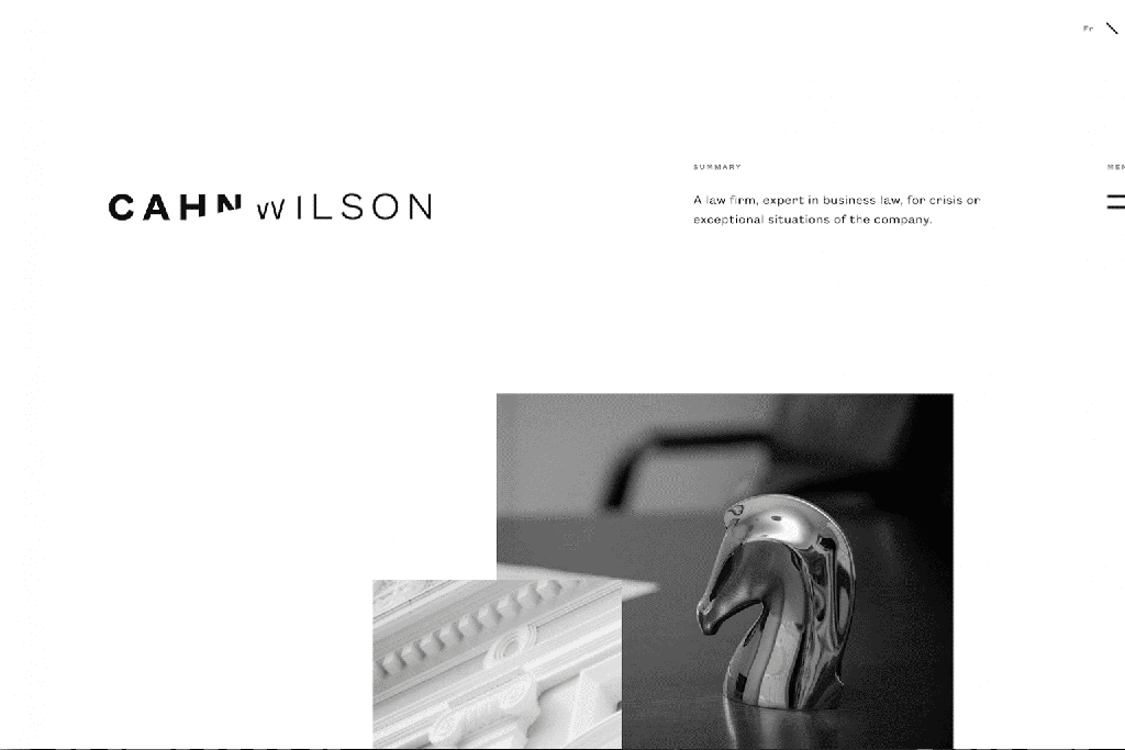
Rejection of brightness is another trend that can be traced not only on portals but also in branding. Tired of all sorts of color combinations, creative minds decided to return to black and white cinema. This direction is also well traced in logos, where gradually depart from iridescent and succulence.
The black-and-white foundations of web design impress with clarity and identity. They attract attention and cling to their minimalism.
Trending colors
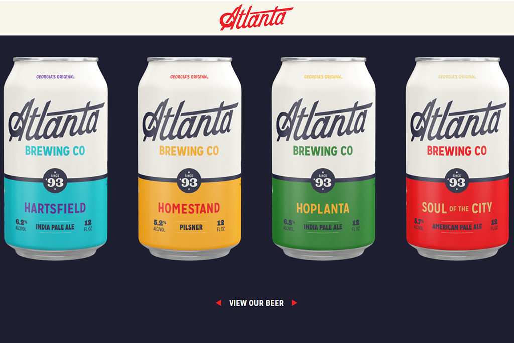
If you do decide to use a color palette, then choose trendy shades. And while the famous Pantone encourages everyone to wear classic blue, the popular foreign photo stock team conducted research and found that Internet users prefer other, more saturated tones. The list included:
- Red-orange;
- The color of seawater;
- Blue with a purple impurity.
The main secret lies in the correct combination of shades. And here, it is necessary professionalism and creative vision.
Modern design and technology
In addition to trends that change the basics of web design, do not forget about technologies that are developing at an extraordinary speed and require an operational application. Without innovation, it is impossible to claim the interest of the audience entirely. And here are three main trends:
Today, these are not useless programs that have been more irritating than beneficial. Discoveries in the field of artificial intelligence contributed to their improvement. They quickly replace the support service by responding to popular recipient requests. And, most importantly, chatbots are available around the clock, which further contributes to the acquaintance of users with the online project.
Of course, they still do not understand humor and can not answer a strange question. But it’s just a matter of time.
Another super trendy, which is rapidly gaining momentum. Thanks to the development of computer speech recognition technology, voice search has become very popular among users worldwide. And, of course, that the site needs it as a breath of fresh air.
Communicating with the portal commands is the way to increase traffic. For web projects, voice input is a wonder, but it’s worth taking a closer look at it. Moreover, shortly they predict the emergence of intelligent agents based on speech technologies.
Many consider them an irritating and repulsive factor, but only in the form, they present today. It would be best if you used them correctly to increase the interest of the online community. For example, put helpful announcements in them.
In addition, push notifications won’t deter users if you set up their theme and frequency correctly. And be sure to turn on the function of locking them.
External changes: follow or not?
Which creative moves to apply to increase conversion? Do I need to redesign at all?
Don’t rush to a solution. Even if some trends seem incredibly cool to you, remember that the most critical mission is to create a product that will help visitors achieve their goals. To do this, it should be as convenient and functional as possible. And here, it is impossible not to remember about adaptive design.
You can also read: Using ready-made templates for Web Designing: Yes or No?
The designer will help to adapt the site at a distance. Finding the right person on a flexible schedule is easy and will help in this freelancing exchange. The main thing is not to put off the decision in a long box.
It would be best if you always put usability first. Customer satisfaction should be paramount in deciding whether to implement an update. All, in the end, is aimed at indulging the requests of the public. For this reason, there is an increase in the emotionality of the digital sphere.
On the one hand, interfaces are noticeably simplified, and on the other hand, the stages of their development are complicated. So apply only those innovations that will improve the project, improve its usability, and best reflect your company’s values—and freelancing to help you!

